Gene flow plots in R
Creating circular plots in R to show gene flow
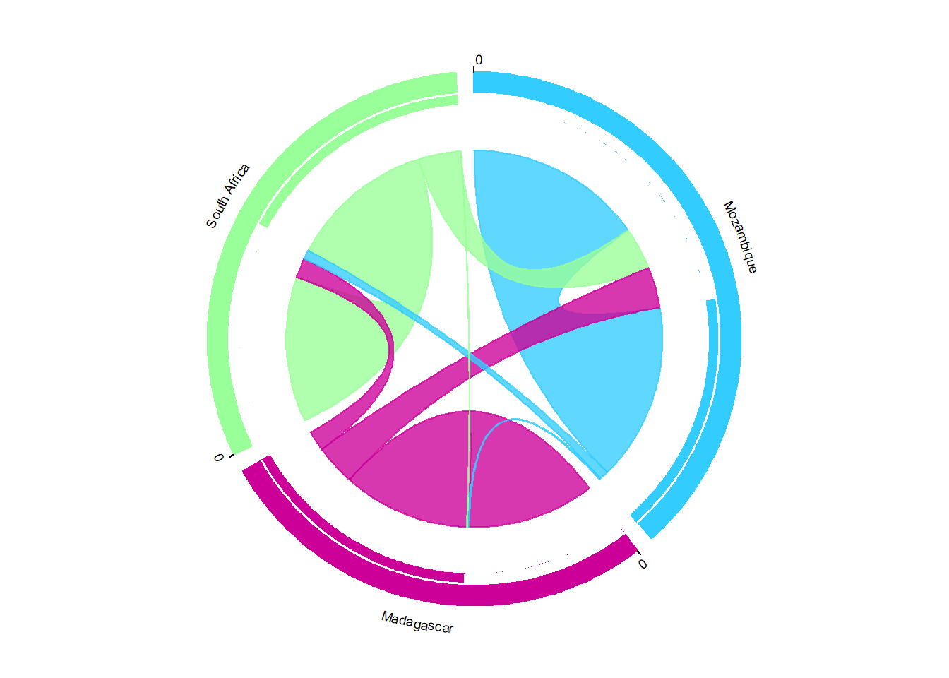
I really like my figures to be aesthetically pleasing along with conveying the most important results. When trying to figure out how best to present the results from gene flow analysis using Migrate-n and BayesAss I came across the program circos . Although it is mainly used for genomic data visualization, circos presents a really cool way to showcase many types of data and relationships in a circular format. The software has to be purchased, but if you have a tight budget, there are other options such as packages developed for R- statistical programming language https://www.ncbi.nlm.nih.gov/pmc/articles/PMC3765848/
I decided to use the circlize and migest R-package to display the data generated from Migrate-n and BayesAss analyses. It isn’t particularly difficult, especially if you’re familiar with R.
Here is a stunning example where it is used to visualize global human migration: http://www.global-migration.info/
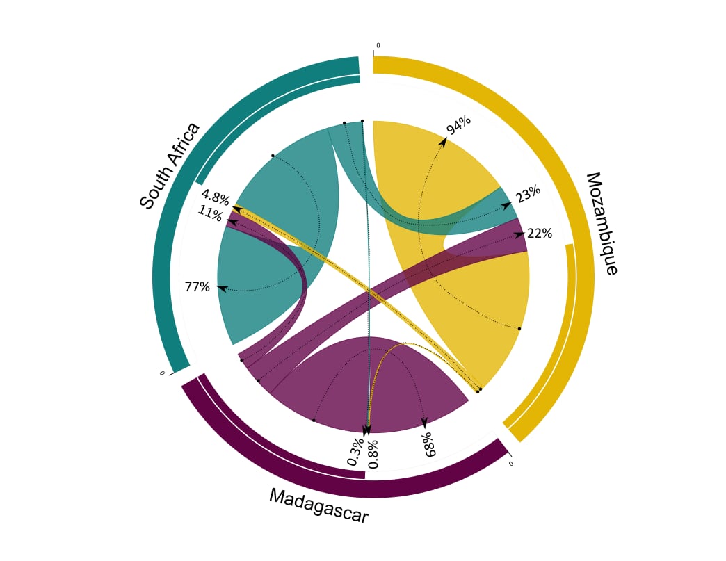
And now that you’ve been inspired, on to how to do it! Here is how I did it using my lobster gene flow results from Migrate-n. I used the sample code from http://www.r-graph-gallery.com/122-a-circular-plot-with-the-circlize-package/ and just adapted it for my data, which you can do as well. Why re-invent the wheel, right?
Download and install the packages needed and then load them into R-studio, or your preferred editor. Then you need some data of course. This shows an example of the data frame I used.Rgb refers to the colours that you want the links and segments of the plot to be. Here is a nice resource for obtaining rgb colour codes from attractive colour palettes https://rgbcolorcode.com/
### You need several libraries
library(circlize)
## ========================================
## circlize version 0.4.8
## CRAN page: https://cran.r-project.org/package=circlize
## Github page: https://github.com/jokergoo/circlize
## Documentation: http://jokergoo.github.io/circlize_book/book/
##
## If you use it in published research, please cite:
## Gu, Z. circlize implements and enhances circular visualization
## in R. Bioinformatics 2014.
## ========================================library(migest)
library(dplyr)##
## Attaching package: 'dplyr'## The following objects are masked from 'package:stats':
##
## filter, lag## The following objects are masked from 'package:base':
##
## intersect, setdiff, setequal, union### Make data
m <- data.frame(order = 1:3,
country = c("Mozambique", "Madagascar", "South Africa"),
V3 = c(0.9436, 0.2174, 0.2250),
V4 = c(0.0083, 0.6771, 0.0030),
V5 = c(0.0481, 0.1056, 0.7720),
r = c(51, 204, 153),
g = c(204, 0, 255),
b = c(255, 153, 153),
stringsAsFactors = FALSE)
df1 <- m[, c(1,2, 6:8)]
m <- m[,-(1:2)]/1e04
m <- as.matrix(m[,c(1:3)])
dimnames(m) <- list(orig = df1$country, dest = df1$country)
#Sort order of data.frame and matrix for plotting in circos
df1 <- arrange(df1, order)
df1$country <- factor(df1$country, levels = df1$country)
m <- m[levels(df1$country),levels(df1$country)]
### Define ranges of circos sectors and their colors (both of the sectors and the links)
df1$xmin <- 0
df1$xmax <- rowSums(m) + colSums(m)
n <- nrow(df1)
df1$rcol<-rgb(df1$r, df1$g, df1$b, max = 255)
df1$lcol<-rgb(df1$r, df1$g, df1$b, alpha=200, max = 255)
### Plot sectors (outer part)
par(mar=rep(0,4))
circos.clear()
### Basic circos graphic parameters
circos.par(cell.padding=c(0,0,0,0), track.margin=c(0,0.15), start.degree = 90, gap.degree =4)
### Sector details
circos.initialize(factors = df1$country, xlim = cbind(df1$xmin, df1$xmax))
### Plot sectors
circos.trackPlotRegion(ylim = c(0, 1), factors = df1$country, track.height=0.1,
#panel.fun for each sector
panel.fun = function(x, y) {
#select details of current sector
name = get.cell.meta.data("sector.index")
i = get.cell.meta.data("sector.numeric.index")
xlim = get.cell.meta.data("xlim")
ylim = get.cell.meta.data("ylim")
#text direction (dd) and adjusmtents (aa)
theta = circlize(mean(xlim), 1.3)[1, 1] %% 360
#plot country labels
circos.text(x=mean(xlim), y=1.7, labels=name, facing = "bending.outside", cex=0.6, niceFacing = TRUE)
#plot main sector
circos.rect(xleft=xlim[1], ybottom=ylim[1], xright=xlim[2], ytop=ylim[2],
col = df1$rcol[i], border=df1$rcol[i])
#blank in part of main sector
circos.rect(xleft=xlim[1], ybottom=ylim[1], xright=xlim[2]-rowSums(m)[i], ytop=ylim[1]+0.3,
col = "white", border = "white")
#white line all the way around
circos.rect(xleft=xlim[1], ybottom=0.3, xright=xlim[2], ytop=0.32, col = "white", border = "white")
#plot axis
circos.axis(labels.cex=0.6, direction = "outside", major.at=seq(from=0,to=floor(df1$xmax)[i],by=5),
minor.ticks=1, labels.away.percentage = 0.15)
})## Note: 1 point is out of plotting region in sector 'Mozambique', track
## '1'.## Note: 1 point is out of plotting region in sector 'Mozambique', track
## '1'.## Note: 10 points are out of plotting region in sector 'Mozambique',
## track '1'.## Note: 1 point is out of plotting region in sector 'Madagascar', track
## '1'.
## Note: 1 point is out of plotting region in sector 'Madagascar', track
## '1'.## Note: 10 points are out of plotting region in sector 'Madagascar',
## track '1'.## Note: 1 point is out of plotting region in sector 'South Africa', track
## '1'.
## Note: 1 point is out of plotting region in sector 'South Africa', track
## '1'.## Note: 12 points are out of plotting region in sector 'South Africa',
## track '1'.### Plot links (inner part)
### Add sum values to df1, marking the x-position of the first links
### out (sum1) and in (sum2). Updated for further links in loop below.
df1$sum1 <- colSums(m)
df1$sum2 <- numeric(n)
### Create a data.frame of the flow matrix sorted by flow size, to allow largest flow plotted first
df2 <- cbind(as.data.frame(m),orig=rownames(m), stringsAsFactors=FALSE)
df2 <- reshape(df2, idvar="orig", varying=list(1:n), direction="long",
timevar="dest", time=rownames(m), v.names = "m")
df2 <- arrange(df2,desc(m))
### Plot links
for(k in 1:nrow(df2)){
#i,j reference of flow matrix
i<-match(df2$orig[k],df1$country)
j<-match(df2$dest[k],df1$country)
#plot link
circos.link(sector.index1=df1$country[i], point1=c(df1$sum1[i], df1$sum1[i] + abs(m[i, j])),
sector.index2=df1$country[j], point2=c(df1$sum2[j], df1$sum2[j] + abs(m[i, j])),
col = df1$lcol[i])
#update sum1 and sum2 for use when plotting the next link
df1$sum1[i] = df1$sum1[i] + abs(m[i, j])
df1$sum2[j] = df1$sum2[j] + abs(m[i, j])
}
circos.clear()I normally do a bit more customization using Inkscape to get it looking perfect:

That’s it! If you have any comments, questions or suggestions on how to improve this plot, please e-mail or DM me